Don’t have time to read it all?
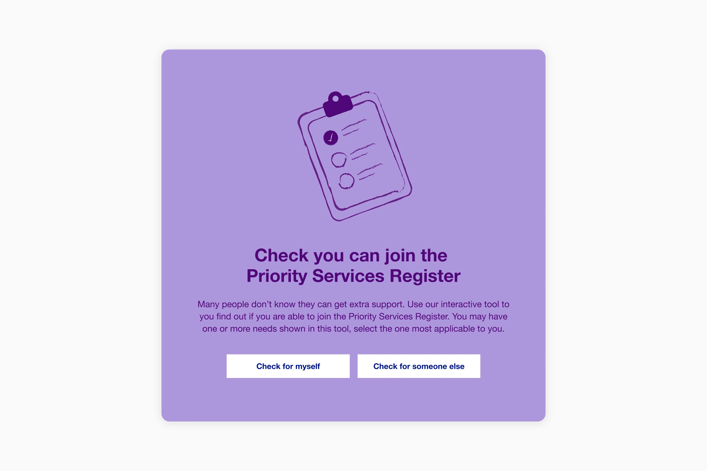
I led the design of an eligibility checker for National Grid’s Priority Services Register, helping vulnerable customers quickly find out if they qualify for extra support. The tool can provide some customers with an answer within 2 clicks
- Point 1
- Point 2
The team
I led the design lifecycle, from initial discovery to implementation for Appointedd’s new ticket generation and attendee check-in features. With unique QR-coded tickets, attendees can be quickly verified and checked in, helping to reduce wait times and keep event entry smooth and efficient.
- Lead design: Me
- Content Design: Emma Cragg
- Senior Developer: Graham Bell
Context and problem
There are around 16 million people in the UK living with a disability.1 The PSR (Priority Services Register) exists to make sure the most vulnerable energy customers get extra support from their electric or water company when they need it most.
Nearly 72,000 PSR applications were submitted online to National Grid in a single year,2 but we didn't know how many more eligible customers weren't applying.
National Grid's current PSR form wasn’t helping. It was vague about who actually qualified, and that vagueness was contributing to eligible customers choosing not to apply.
Changing health landscape
The older population in England is getting larger. In the last 40 years, the number of people aged 65 and over has increased by over 3.5 million (a 52% increase).3
In the 10 years since 2013/14, the estimated number of disabled people has increased by 4.9 million (+41%).4
These statistics show with an ever ageing population, and disability prevalence rising, it's important to provide the correct support to those who need it.
The approach
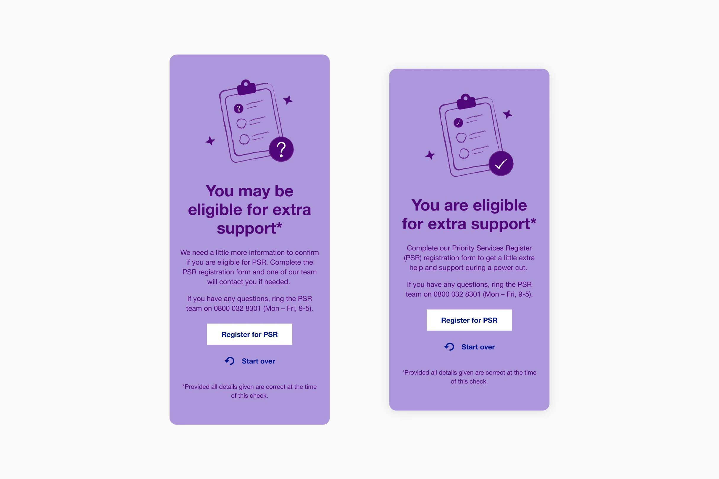
Ofgem had been pushing energy companies to find more innovative ways to increase PSR sign-ups. Rather than redesigning the full application form, we proposed something lighter. An eligibility checker that answers one question fast: do I qualify for PSR?
Structuring the flow
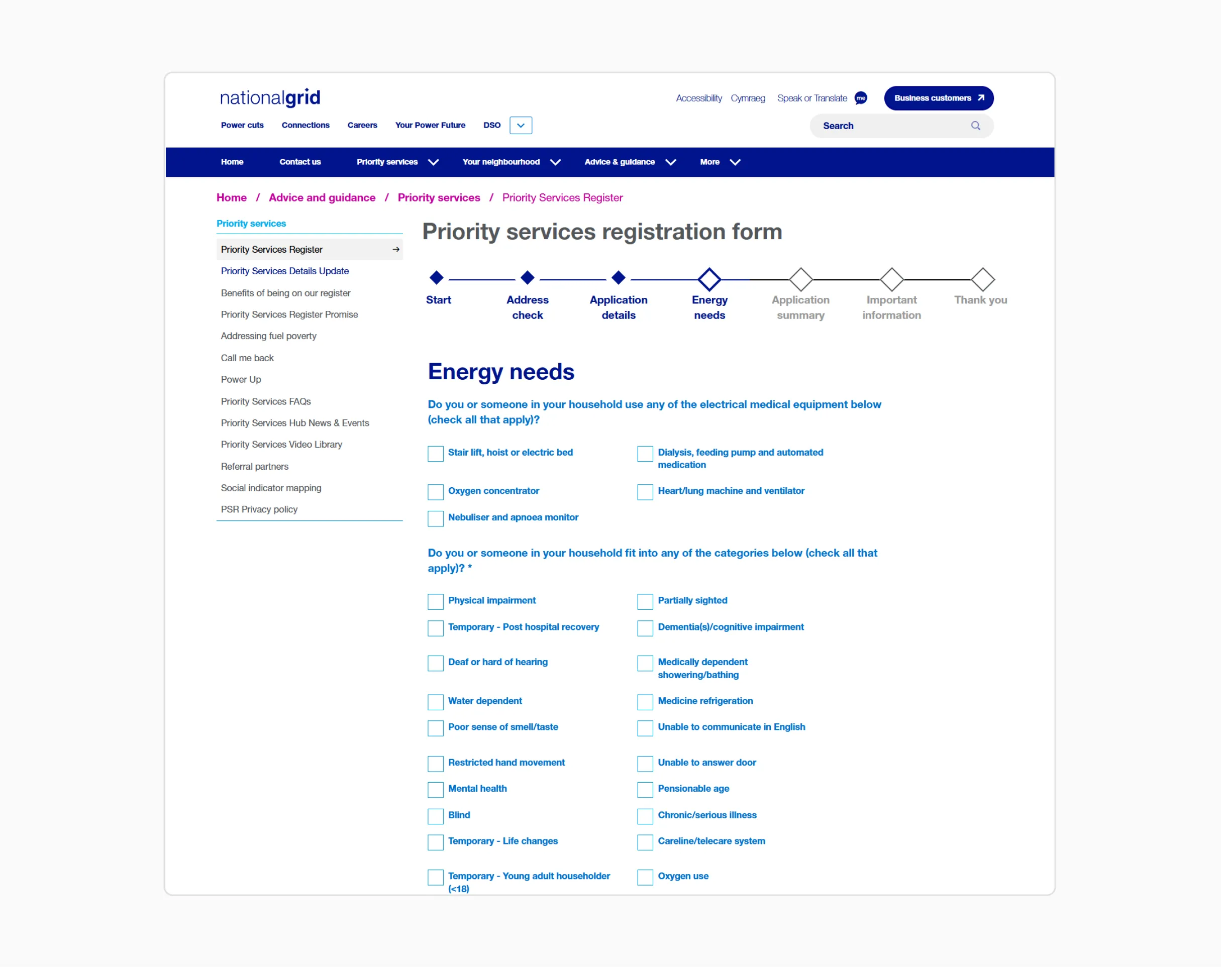
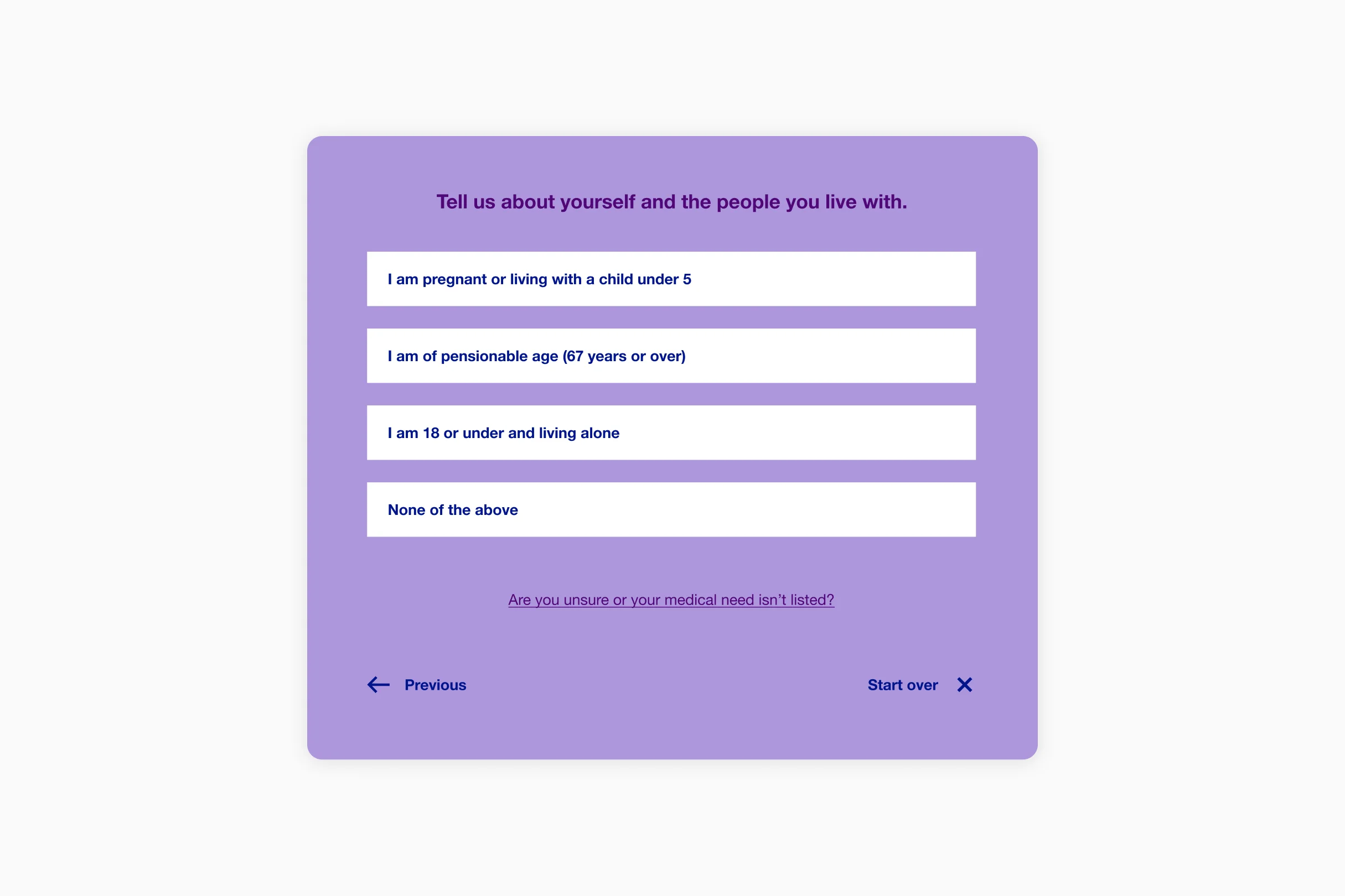
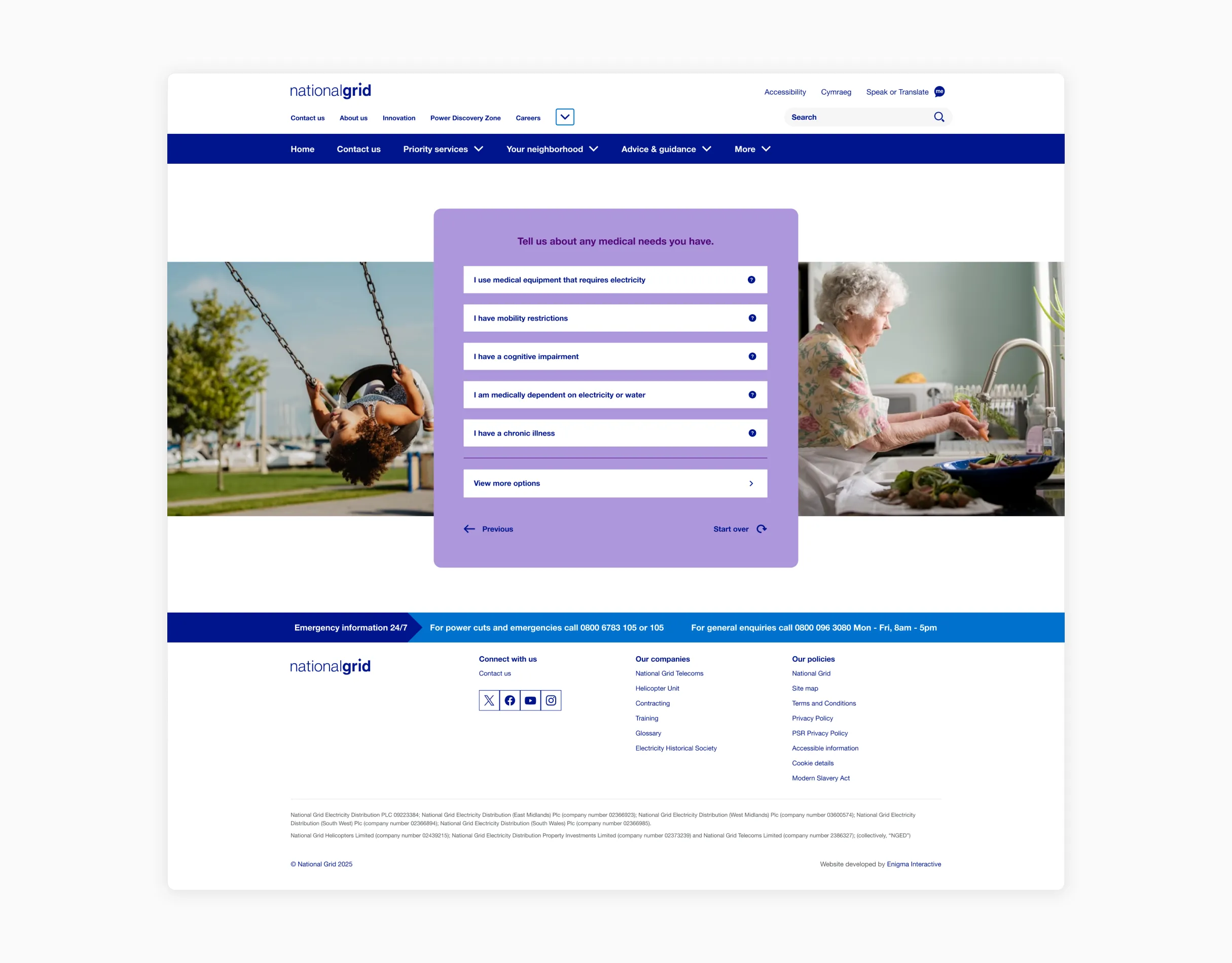
National Grid's existing form split PSR criteria into two categories: electrical medical equipment and all other health needs. That wasn't the right shape for a tool designed to reassure people quickly.
Rather than presenting every option at once, I reorganised the flow into a metaphorical funnel. The tool leads with broad and generalist questions first (age, life circumstances), because these cast the widest net and would provide most people with the fastest answer. Medical needs came next, then communication needs and lastly temporary needs. The idea was simple, lead with options most likely to apply and work inward from there.
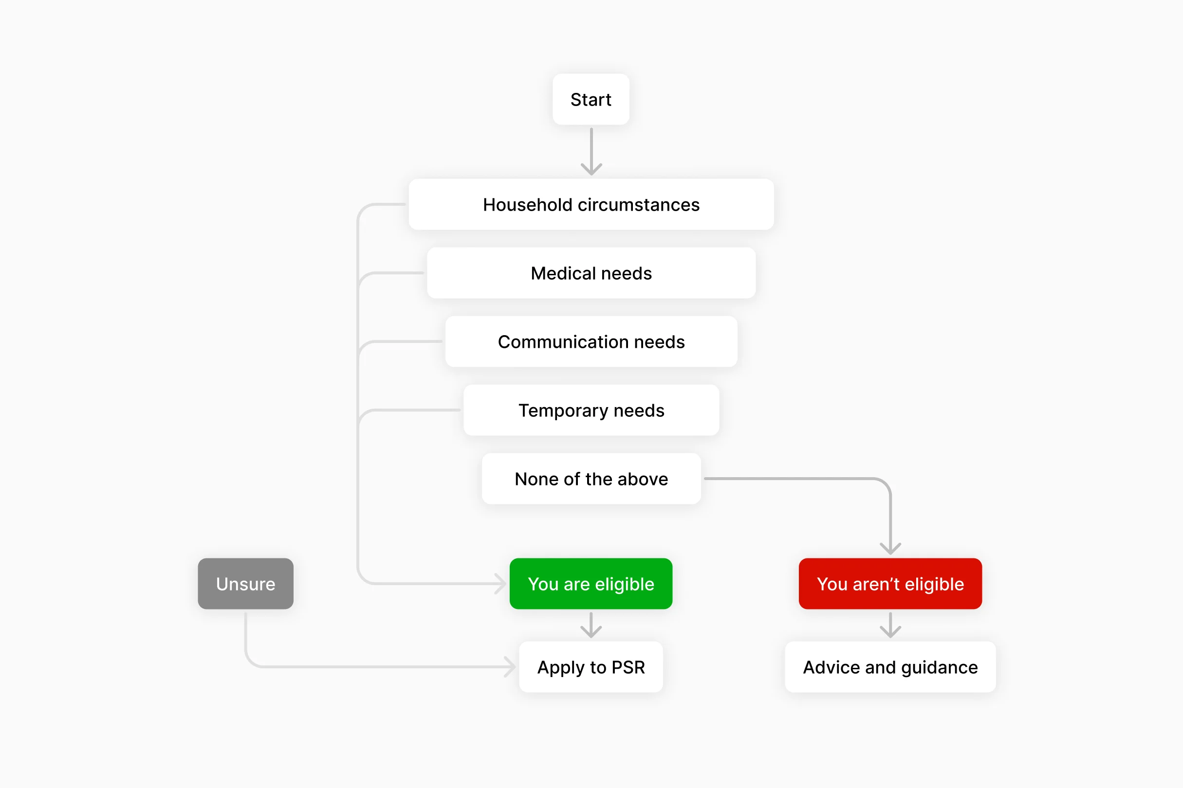
A customer may well have 5 options apply to them but this tool was designed to supply them with an answer fastest by selecting the first option that applies. The more detailed form can capture those other health needs later in the process.
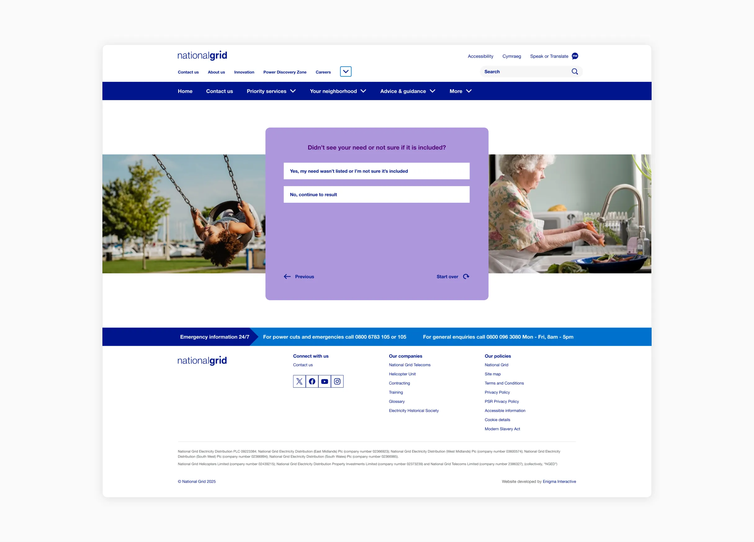
Unsure if you qualify?
A huge aspect of this tool was to try and encourage customers who are unsure if they are eligible, to apply anyway. For those caught in between a definite yes and no, we wanted to reassure them and advise them to apply.
Early iterations of the tool included an "unsure" option alongside the other choices in each category. A customer who is unsure if their medical need is covered in one category might be a definite yes in another.
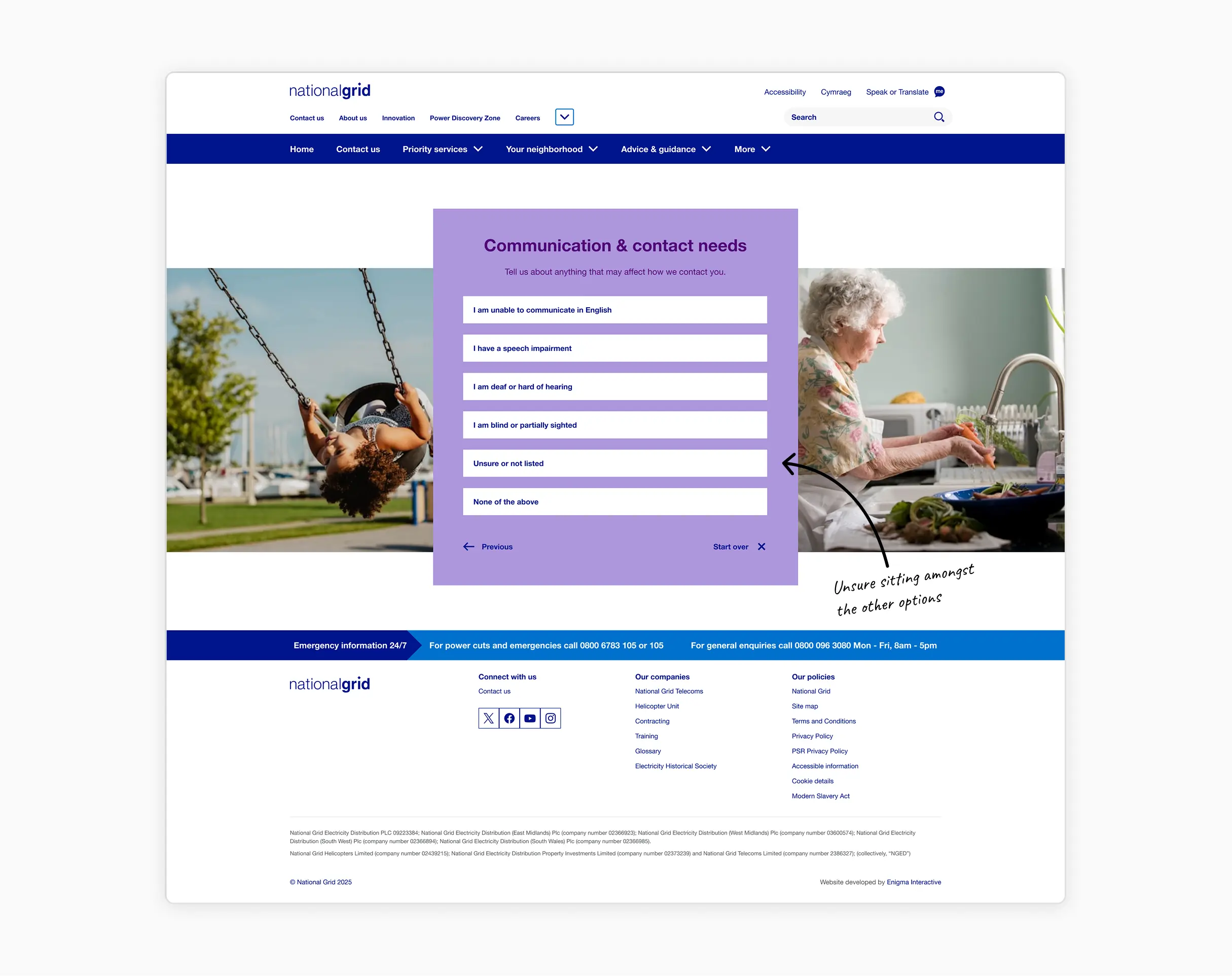
However, "unsure" sitting amongst the health conditions felt like it didn’t truly fit. It was essentially a help option dressed up as a choice, and I didn’t want somebody to feel they have to be unsure about one specific category.
I chose to move "unsure" out of the options entirely and, instead, made it a permanent help link anchored at the bottom. This way it was always visible, and never in the way of the other PSR options.
This decision also simplified the back-end logic. Reducing the decision tree by 50%. That was because selecting unsure created a split in the decision tree where the system had to understand if the user moving on has flagged unsure at any point which would eventually lead them to a ‘you may be eligible’ screen.
Design validation
Ideally, a tool designed for vulnerable customers would undergo extensive external testing, but a tight timeline meant we had to be strategic. I leaned heavily into the existing NGED design system and built 90% of the experience using established NGED design system patterns. We could skip testing the basic UI and focus our internal sessions entirely on the flow and tone of voice.
To validate the UX, I ran sessions with colleagues from across the business, specifically including those who were already on a PSR themselves. Their feedback was incredibly consistent and helped us quickly pinpoint the main friction points while saving significant time and budget.
- Many participants completely missed the "unsure" help provider.
- The introductory page didn't clearly explain what the Priority Services Register actually is.
- Inline tooltips were overlooked by all participants.
- Clicking "None of the above" was ambiguous and users didn't realise it would lead them to a subsequent category of needs.
Technical feasbility
I needed to prove the technical feasibility of the design. While we reused a significant amount of existing components, the new flow required some custom elements and styling. We built and deployed the tool in a pre-prod environment, which was a critical step. It gave us a 1:1 understanding of exactly what backend logic changes were required to seamlessly align our new flow with National Grid’s existing architecture before pushing to production.
Softening the visuals
The users coming to this tool may be managing chronic illness, caring for a vulnerable relative, or dealing with a difficult diagnosis. The design had to feel approachable without feeling patronising.
National Grid's palette is predominantly blue and white which often portrays a functional and corporate feeling. I reached into their extended palette and used lilac and purple instead. A custom set of icons were also created, helping contribute to the approachable feeling.
I worked within National Grid's existing component library, updating and refreshing where needed. It kept the build extremely lean whilst also providing us with exactly what we needed it to do.
Tone of voice
I worked closely with our content designer to manage expectations clearly. National Grid flagged early that customers often assumed PSR offered more than it does, and with high anticipated usage, that expectation needed addressing in the content.
The tool reflected the PSR form of being able to submit a claim for yourself or on behalf of somebody else. The language reflected that to ensure there was no confusion about the journey taken by customers.
Project outcomes
Most users can find out if they are eligible for PSR within two clicks. Given the old experience required completing an entire form before finding out if you even qualified. This felt like a meaningful shift towards Ofgems goal of getting more customers, who are eligible, onto the register.
We defined success for this tool by looking beyond a 'you are eligible' result. The ultimate goal was driving those users to the PSR application. Due to system tracking limitations, we cannot directly attribute final application completions to this tool. Instead, we established increased traffic to the main application form as our primary success metric. We are actively tracking this data to see if reducing that up front complexity translates to a long term increase in sign ups.
